Next: A..18 ラプラシアン Up: A. Tips Previous: A..16 文字に色をつける
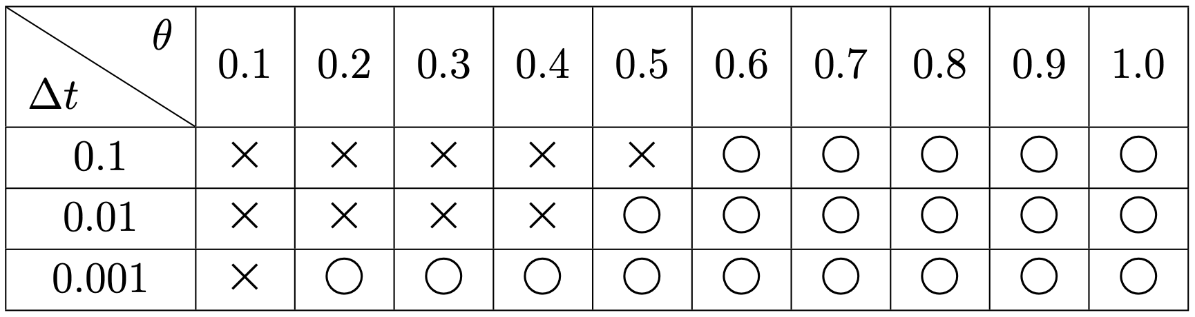
2次元の表を作る時に、行と列が何を表すか、斜め線を引いて説明を書くことがある -- これで説明になっているか自信がないが、 例えば次のような表。
\usepackage{diagbox}

...

\begin{tabular}[t]{|c|c|c|c|c|c|c|c|c|c|c|}
\hline
\diagbox{$\Delta t$}{$\theta$} & $0.1$ & $0.2$ & $0.3$ & $0.4$ & $0.5$ &
 $0.6$ & $0.7$ & $0.8$ & $0.9$ & $1.0$ \\
\hline
 $0.1$ & × &× &× &× &× &○&○&○&○&○\\
\hline
 $0.01$  & × &× &× &× &○ &○&○&○&○&○\\
\hline
 $0.001$ & × &○ &○ &○ &○ &○&○&○&○&○\\
\hline
\end{tabular}
|